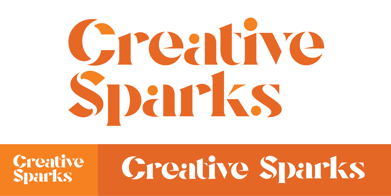
Logo & Wordmark: Custom wordmark featuring sharp stencil cuts and geometric balance to create a strong, recognizable lockup.
Color Palette: A vibrant mix of warm oranges paired with clean neutrals and dark contrast tones, chosen to convey warmth and energy.
Design Direction: Uses layered light, sharp lines, and motion-forward elements to reflect the idea of a “spark”.
Logo / Wordmark
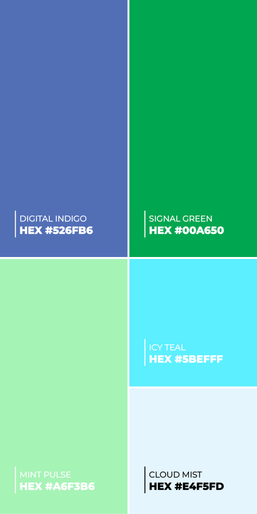
Colors
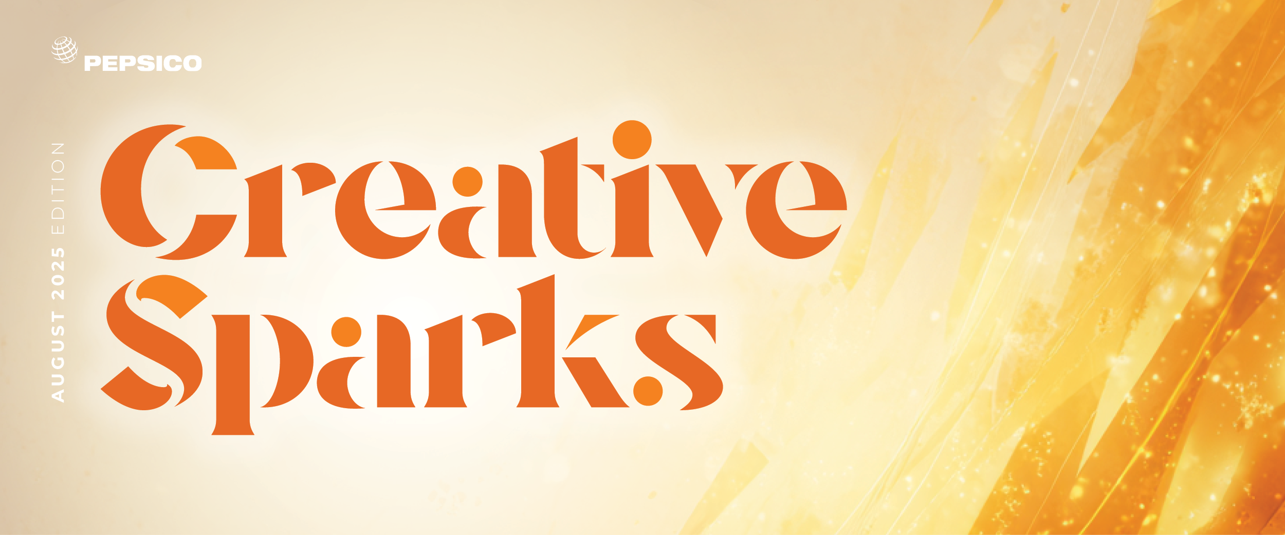
Newsletter Header Sample
Alt Looks
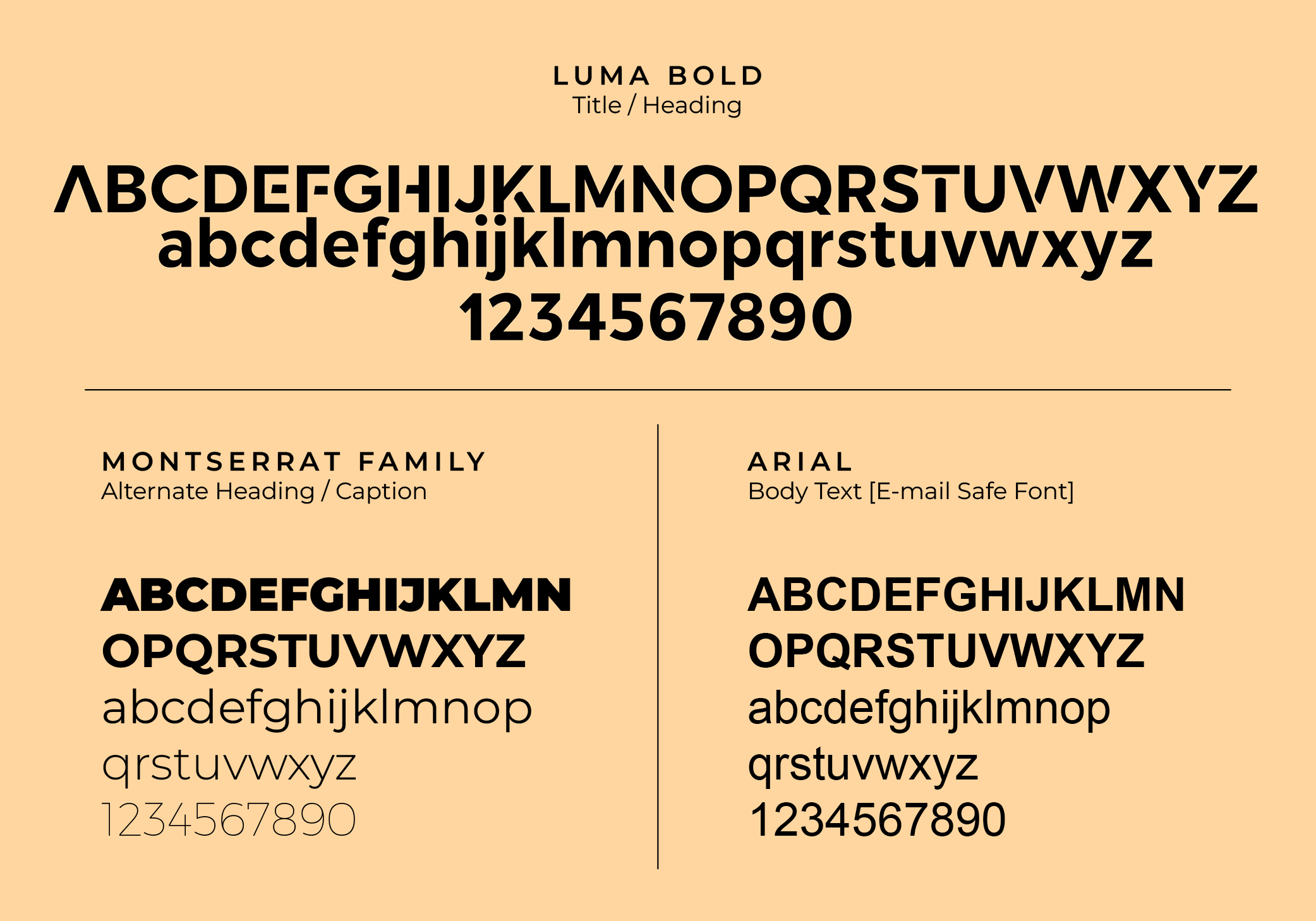
Typography
Concept 2
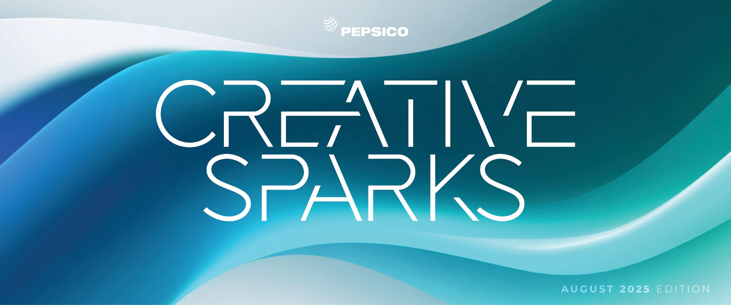
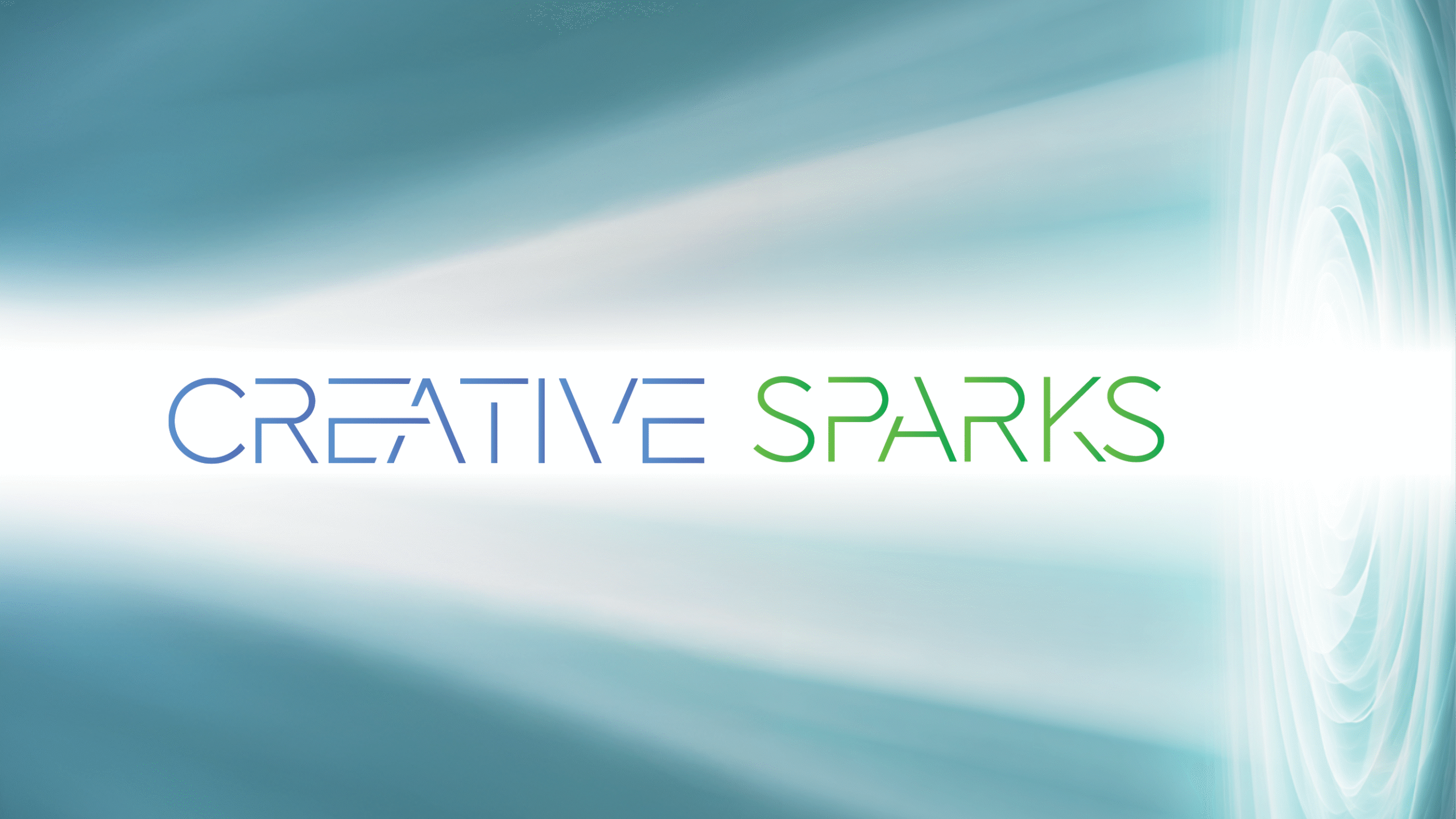
Logo & Wordmark: Built from a minimalist, line-based type style that uses sharp angles and intentional gaps to reflect structure, motion, and digital precision.
Color Palette: A cool, vibrant mix of blue and green tones balanced by soft neutrals, chosen to feel fresh, clear, and creatively energizing without overwhelming the content.
Design Direction: Smooth gradients, directional light, and flow-based elements reinforce the idea of a creative current, giving the newsletter a sense of momentum and visual clarity.
Logo / Wordmark
Colors
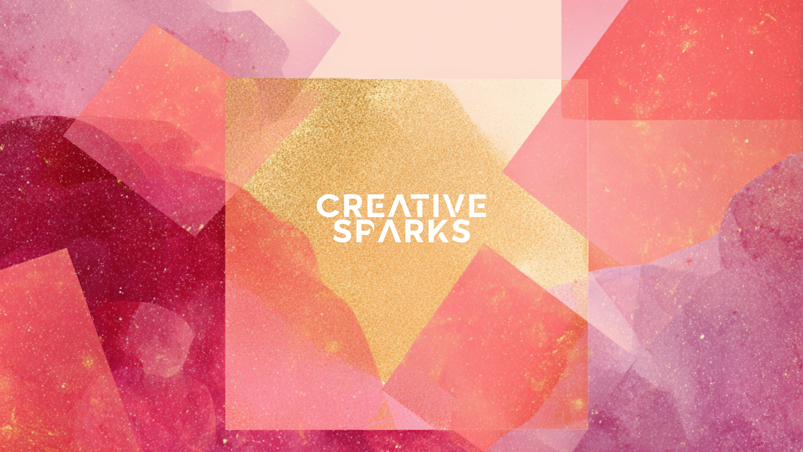
Newsletter Header Sample
Alt Looks
Typography
Concept 3
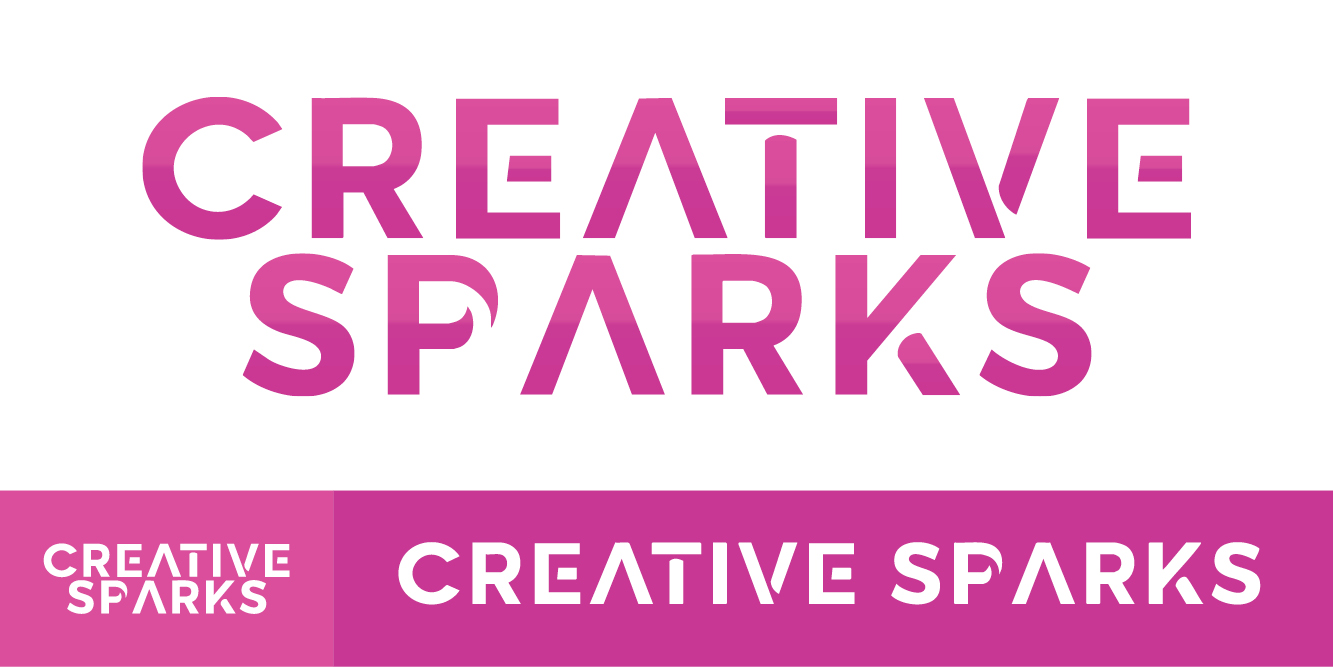
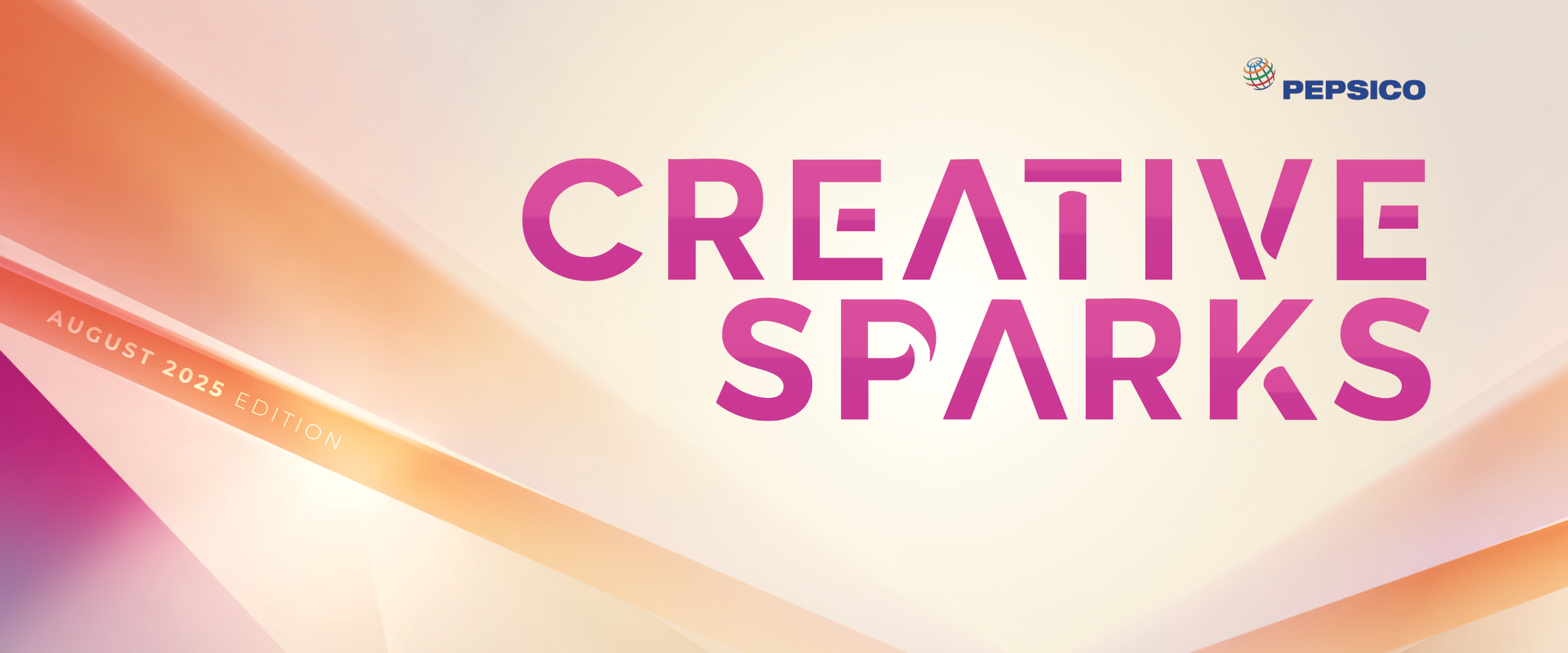
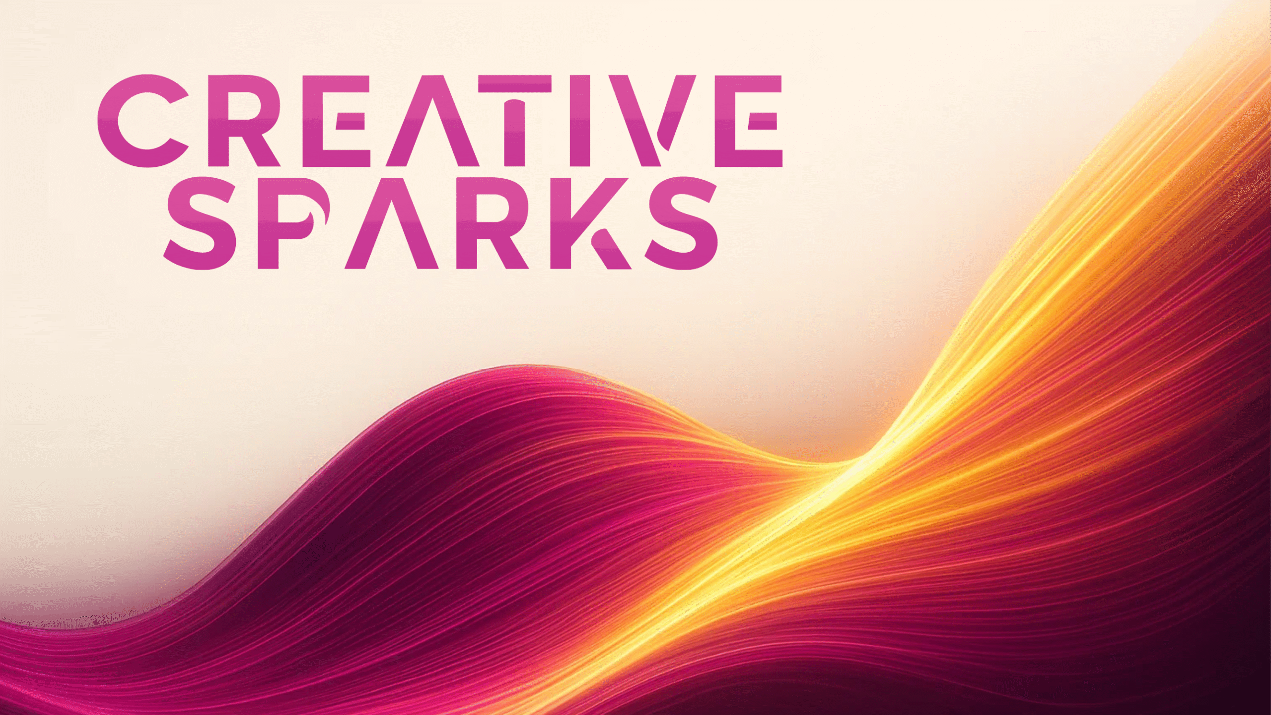
Logo & Wordmark: Uses bold, rounded letterforms with angular customizations to create a look that feels expressive and creatively charged.
Color Palette: A high-energy blend of pinks, purples, and golds, selected to suggest imagination, optimism, and creative momentum.
Design Direction: Uses light bursts, gradients, and layered textures to visualize the idea of inspiration taking shape, tying into the theme of igniting new ideas.